
Over the past few weeks, I have used HyperFrames to make several very different kinds of video: an HHY Web Runtime launch film, an HHY v1.7.0 product launch, a roughly two-minute getting-started tutorial, a repeatable course pipeline, and a 9:16 mobile short.
Their purposes differ. A launch film needs to establish one memorable idea in a few seconds. A tutorial must keep code and narration aligned. A course must support repeated production. A vertical short depends more heavily on one coherent visual concept. After completing these projects, however, I became increasingly certain of one thing: the difficult part of video production is not making an element move. It is making content, time, media, sound, and verification behave as one system.
HyperFrames is valuable to me because it represents video as HTML. Scenes are DOM structures, animation has addressable time, images, code, audio, and sub-compositions are project files, and a deterministic render pipeline produces the final MP4. It feels familiar as an engineering medium: visual work still requires judgment, but the structure is readable, changes are reproducible, and errors can be checked.

I Define What the Video Must Prove First
The easiest way to lose direction is to begin with transitions, particles, or a 3D effect. The frame may become busy while leaving the viewer unable to explain what the product is.
I now start with a short production contract that answers at least five questions:
| Question | Answer I need |
|---|---|
| Core message | What single sentence should the viewer remember? |
| Audience | Developers, learners, or a broader mobile audience? |
| Evidence | Which code, interfaces, and results can I show truthfully? |
| Boundaries | Which capabilities are not shipped and must stay out? |
| Destination | Landscape, portrait, website, social media, or a course? |
For the HHY v1.7.0 launch film, the throughline was not “we built many features.” It was: HHY has grown from a flow-first language into a system for building real applications. I divided 41 seconds into six responsibilities: Logo, language, compiler, ETL, CMS, and invitation. Each section carries one information task.
This also controls technical claims. A release film can say “Verified optimizing compiler and Runtime,” but a faster result in one bounded benchmark must not become a performance promise for every program. Short video copy tends to remove conditions, so evidence boundaries must be settled before animation begins.
A Storyboard Is a Time Budget, Not a Shot List
I once treated a storyboard as a list: show a title in scene one, code in scene two. In production, it behaves more like a time budget.
A six-second scene cannot comfortably contain a title entrance, three lines of typed code, an unfolding architecture, a result count, and an exit transition. The software can execute all of those events, but the viewer cannot finish reading them.
I break a scene into smaller phases:
0.0–1.4s  establish the headline
1.4–3.2s  show inputs and direction
3.2–4.8s  reveal the central model or result
4.8–6.0s  hold long enough to read
That final hold matters. Animation tools can make stillness feel like wasted time. If every object keeps moving, however, the viewer sees change rather than a conclusion.
In a launch film, I usually assign one primary action to each scene. The |> operator traveling from depth and flipping into the HHY Logo is the opening action; the version line and URL only need to arrive clearly. Turning every detail into the hero removes the actual memory anchor.
HTML Lets Me Treat a Frame as Maintainable Structure
A HyperFrames composition is not a recording of browser activity. The renderable page itself is the video source. The DOM declares when an element begins, how long it lasts, and where it belongs. A paused, seekable timeline means that the same timestamp should produce the same frame.
That creates several practical benefits:
- copy remains editable and localizable instead of being flattened into an image;
- code, terminals, and data cards can remain real text with stable layout;
- scenes can become sub-compositions rather than one endlessly growing HTML file;
- landscape and portrait pieces can share a design language without sharing one composition;
- screenshots at fixed timestamps become review evidence instead of relying on “it looked fine from the beginning.”
HTML does not automatically produce good design. A web page lets a person scroll, wait, and click; a video advances on a fixed clock. A card layout that works on a site can look fragmented at 1920×1080. A beautiful long page can become unreadable when reduced inside a video frame.
My working rule is to use large type, short copy, an explicit hierarchy, and a limited amount of simultaneous information. Real product screenshots must be large enough to inspect. Code should show only the part being explained. Background and decoration must not compete with the body copy for contrast.

Real Assets Decide Whether the Video Is Credible
I prefer the project's actual Logo, executable code, real commands, and real interfaces. A model-generated or illustrated image can establish atmosphere, but it cannot replace product evidence.
The CMS scenes in the HHY v1.7.0 film use the real website and administration interface. Customer counts, departments, and output in the ETL sequence come from a verified fixture. The getting-started tutorial uses runnable .hhy files and real commands, not temporary syntax written solely for the frame.
One practical lesson has become a rule: validate the asset before designing animation around it. If I discover at the end that a screenshot has the wrong aspect ratio, a command fails, or data does not match the release, composition and pacing both need rework.
Once an asset enters the project, I try to freeze it locally. A render should not depend on a network request, randomly select an image at runtime, or change because a remote file changed. This is both a reliability requirement and a provenance requirement.
Tutorial Timelines Must Follow the Learning Process
A product film can use pace to create emotion. A tutorial cannot optimize only for speed. The viewer needs to see the relationship among concept, source, execution, and result.
For the HHY getting-started video, I divided the material into six sub-compositions: welcome, installation, bindings, functions, Flow, and run. Each has its own narration and frame design; together they form one root timeline.
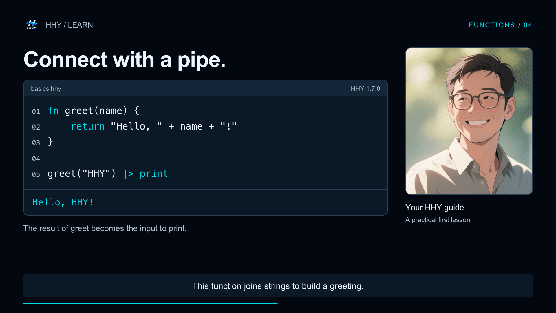
The process left me with several lessons:
- Show the outcome of a section before explaining its syntax.
- Code reveal speed should follow narration, not an animation preset.
- Commands, source, and output need distinct visual levels.
- Captions must not cover the code currently being explained.
- Long sentences should be split using measured speech duration rather than equal timing.
Course production amplifies these concerns. One video can be adjusted by hand. If every episode in a 16-lesson course starts from a blank canvas, visual language and quality drift quickly. I separated the course pipeline into scripts, runnable exercises, narration, sentence timing, captions, compositions, rendering, media validation, and website synchronization.
A template should not force every lesson to look identical. It should settle the parts that should not be debated repeatedly: resolution, brand colors, title area, code area, caption safe area, fonts, audio format, and output checks. Learning objective, example, and pacing remain specific to each lesson.
Sound Is Not a Track to Paste on at the End
For an unnarrated launch film, I establish visual beats first and let music and a few effects support the transitions. In a narrated tutorial, the dependency reverses: measured speech duration determines scene length, and the frame must enter and hold around each sentence.
If I finish an imagined 60-second animation and later receive 73 seconds of narration, increasing playback speed rarely solves the problem. Captions, code reveals, reading holds, and scene connections all need to be redistributed.
I now treat speech as timing data: generate or record it first, measure each sentence, and build scenes and captions from those durations. During rendering, visual video is muted and sound is managed on separate tracks, making replacement and verification easier.
Sound effects require restraint too. A keyboard confirmation, program completion, or major scene transition can justify one distinct cue. Giving every word entrance a sound rapidly consumes attention. Sound should clarify an event, not demonstrate how many effects the tool can play.
One Design Language Does Not Mean One Aspect Ratio
A landscape launch film can use horizontal relationships and wide negative space. A vertical short is closer to single-column storytelling; its subject must remain inside a narrow mobile viewing region. Simply cropping a 16:9 composition to 9:16 usually loses both copy and subject.
For the HHY vertical short, I used one continuous spatial idea: a person lives inside a macOS desktop, Terminal rises above the Dock, a real command is typed, and the HHY Logo emerges from the successful result. The 22-second piece uses no cuts. Every change preserves the same spatial relationship.
This project reminded me that creativity does not necessarily mean more shots. One understandable spatial rule with staged reveals can feel more complete than a sequence of unrelated backgrounds. Portrait work particularly needs deliberate safe areas among the menu bar, Terminal, person, Logo, and closing copy.
Fixed-Time Checks Are More Reliable Than One Playback
The easiest video defects to miss often last only a few frames: copy overlaps during an entrance, an outgoing element remains visible, a transition exposes empty space, an image briefly changes aspect ratio, or a line of code clips mid-animation.
I keep three validation layers:
| Layer | What it checks |
|---|---|
| Static rules | Timing attributes, asset paths, determinism, composition structure |
| Runtime and layout | Page errors, overflow, occlusion, and contrast |
| Render evidence | Timestamped snapshots, contact sheets, media metadata, and final MP4 |
Watching the full piece remains necessary, but it is best for judging rhythm and emotional continuity. Fixed-time sampling is more efficient for layout problems. I capture launch-film posters when the scene's message is stable and inspect both sides of transitions. In tutorials, I additionally compare caption, code reveal, and speech at the same timestamp.
Automated checks do not replace visual judgment. A passing check means the known rules found no error. It does not mean the story is clear, the type is ideal, or the pacing cannot improve. I want the tools to find computable defects while a person decides whether the information deserves to appear and whether the viewer has enough time to understand it.
The Workflow I Kept
After these projects, my working sequence looks like this:
one core message
→ content and evidence boundaries
→ storyboard and time budget
→ prepare and validate real assets
→ HTML scenes and a seekable timeline
→ align voice, captions, and visuals
→ timestamped snapshots and automated checks
→ full-playback review
→ render and validate the final file
The durable lessons are not transition parameters. They are three principles.
First, decide what the viewer should understand before deciding how the frame moves.
Second, put real content into the video instead of using visual polish as a substitute for evidence.
Third, make the video reproducible, inspectable, and editable. When a version, command, image, or language changes, I want to edit structured source rather than reopen a project that can only be adjusted from memory.
HyperFrames does not remove judgment from video creation. It places that judgment inside a medium that feels natural to an engineer: HTML, timelines, files, rules, and repeatable rendering. To me, this is not turning a video into a webpage. It is turning a one-off production process into a content system that can continue to evolve.
A well-engineered video is not the one with the most animation. It is the one where message, evidence, rhythm, and frame agree on the same timeline.